AM

October, 2024
Automations Free Trial | Constant Contact
Ashley Moreno, Product Designer
Get to know the project
Overview
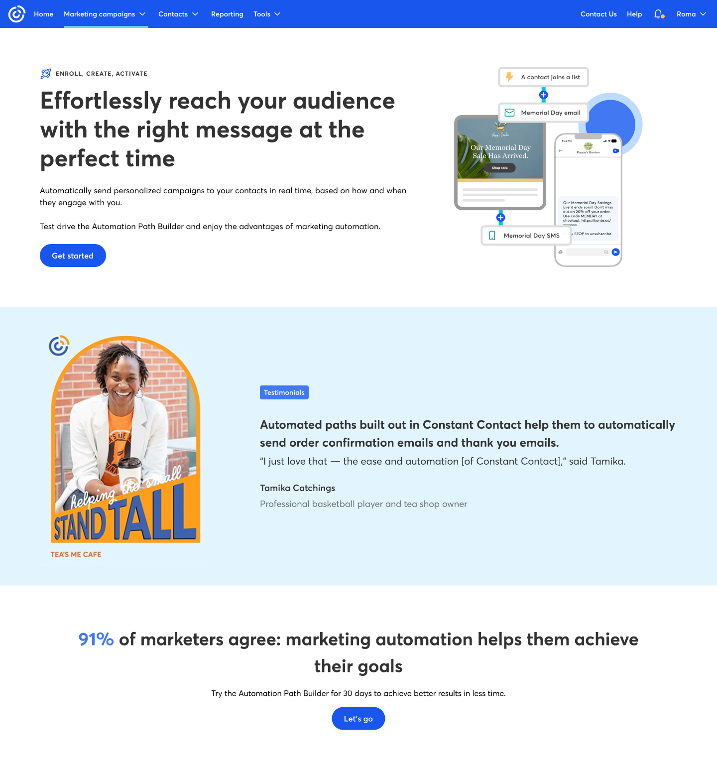
Email marketing automation is like a magic wand for your marketing strategy. This project was designed to give users a trial experience of Constant Contact’s automated builder—allowing them to explore the tool without needing to sign in. Users can experiment with creating automation paths tailored to their organization and goals, selecting their own starting points, branches, and trigger actions for sending emails.
The problem
We needed to tailor the experience for two types of users within the application: standard and premium. Each experience had to be personalized, while also aligning with the other free trial experiences being developed across the platform. Since other designers were building separate trial flows in different areas, we had to coordinate efforts and create a cohesive, unified experience across the board.
The Goal
To create a unified and cohesive experience across user types and ongoing trial flows, while encouraging users to explore the automation feature in a way that feels intuitive and accessible. The objective was to lower the barrier to entry—especially for first-time users—by avoiding overly complex flows, and instead guiding them through a streamlined path that showcases the value of the tool without requiring a full setup.
Key contributions
- Led the UX research efforts, conducting interviews to uncover user motivations, behaviors, and pain points related to marketing automation.
- Defined the user flow and interaction strategy for the trial experience, ensuring it was intuitive for both standard and premium users.
- Designed low- and mid-fidelity prototypes to test different onboarding and automation path configurations.
- Unified the user experience across multiple in-progress free trial initiatives by aligning design decisions with other teams.
- Improved accessibility and clarity in the trial builder by simplifying complex steps and highlighting the core value of the automation feature.
My responsabilities
- Created user flows, wireframes, and UI mockups that supported various user types and aligned with product goals.
- Worked closely with product and engineering teams to bring the experience to life while balancing technical constraints.
- Ensured visual and functional consistency across the automation builder and related experiences in the platform.
- Participated in cross-team syncs to align multiple trial experiences under a unified framework and design language.
- Advocated for a simplified experience by reducing friction and focusing on the core value proposition of the feature.
Design process
This section outlines the different stages and steps I took throughout the creation of this project—from defining the problem space and aligning with stakeholders, to exploring design directions, refining the user flow, and delivering the final experience. Each phase was grounded in clear goals and iterative decision-making to ensure the solution was both user-centered and strategically aligned.

Empathize
User Interviews
User Research

Define
Personas


Ideate
User Flow
Information Architecture

Design
Wireframes
Visual Design


Test
Usability Testing
Feedback
Design challenge
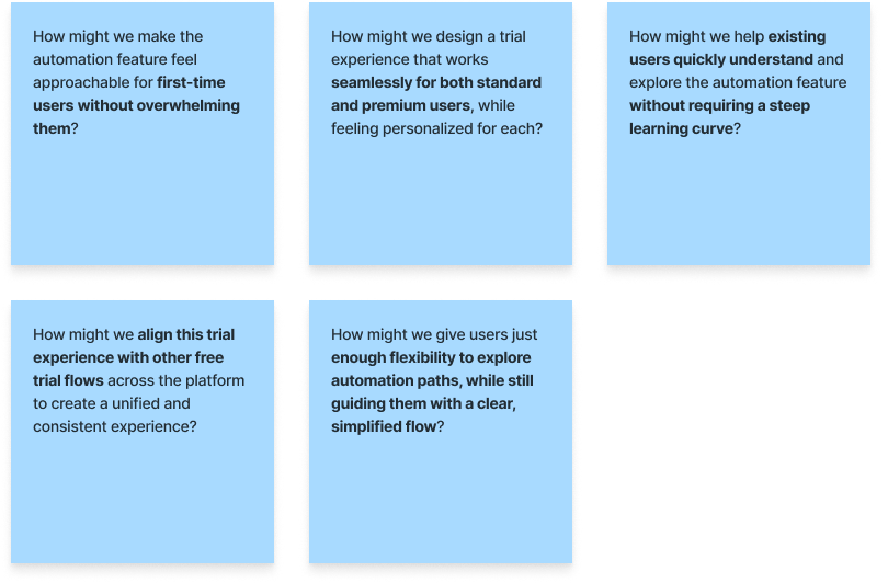
How might we?
To guide the design process and stay focused on solving the right problems, I framed a series of “How Might We” questions. These helped reframe initial challenges into opportunities for innovation, ensuring that the experience would be intuitive, personalized, and aligned with broader platform goals. These prompts served as a foundation for ideation and design decisions throughout the project.
“If you want to create a great product, you have to start by understanding the people who will use it.”

Don Norman
Co-founder and Principal of Nielson Norman Group
Defining the project
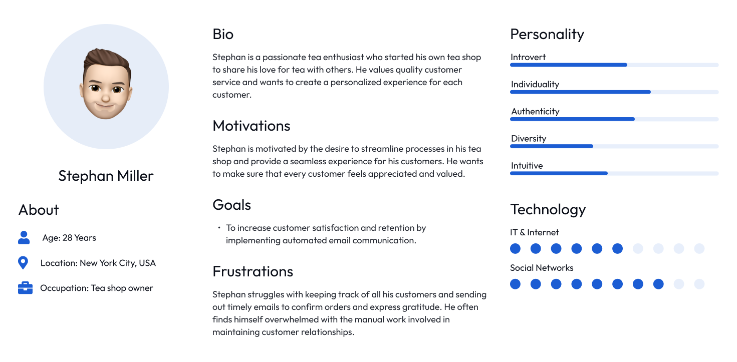
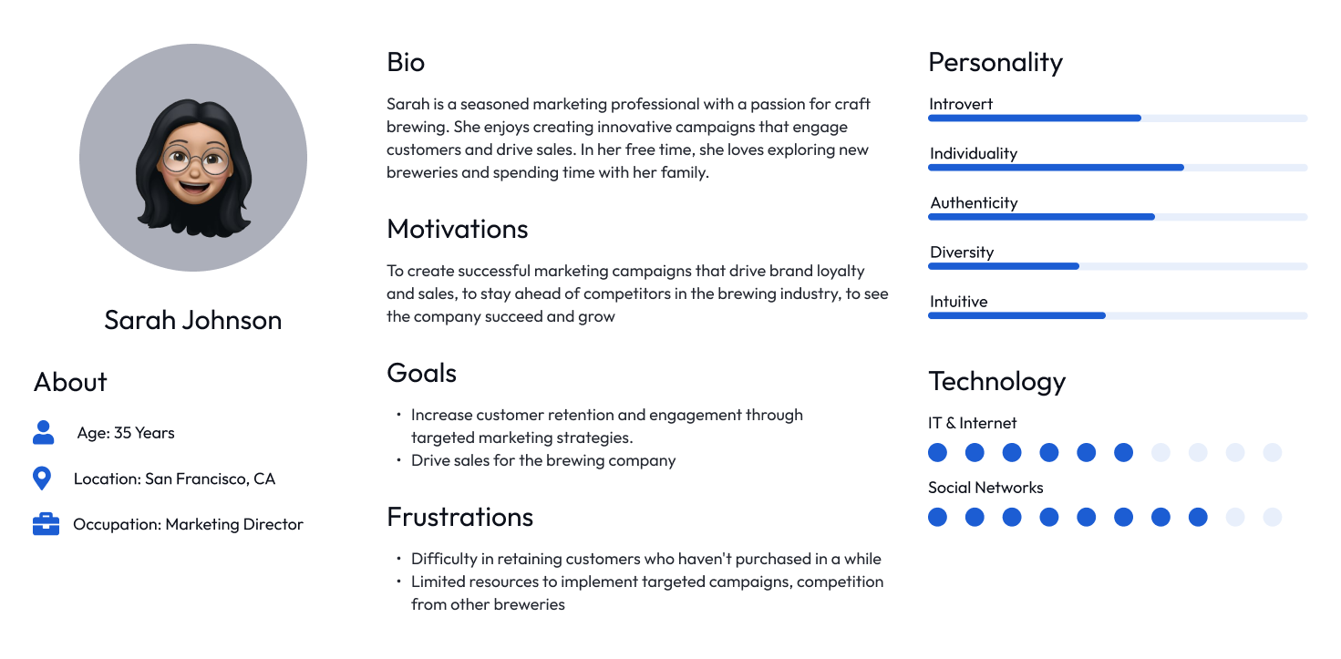
User personas
I defined two key personas—Standard Users and Premium Users—to guide design decisions. While both were existing users, this was often their first time exploring the automation feature. Their different needs and expectations shaped how the trial experience was personalized and simplified.
User persona | Standard user
User persona | Premium user
User flow
Call out a feature, benefit, or value of your site, then link to a page where people can learn more about it.
User flow
Call out a feature, benefit, or value of your site, then link to a page where people can learn more about it.
Design phase
Low-fidelity designs
To guide the design process and stay focused on solving the right problems, I framed a series of “How Might We” questions. These helped reframe initial challenges into opportunities for innovation, ensuring that the experience would be intuitive, personalized, and aligned with broader platform goals. These prompts served as a foundation for ideation and design decisions throughout the project.
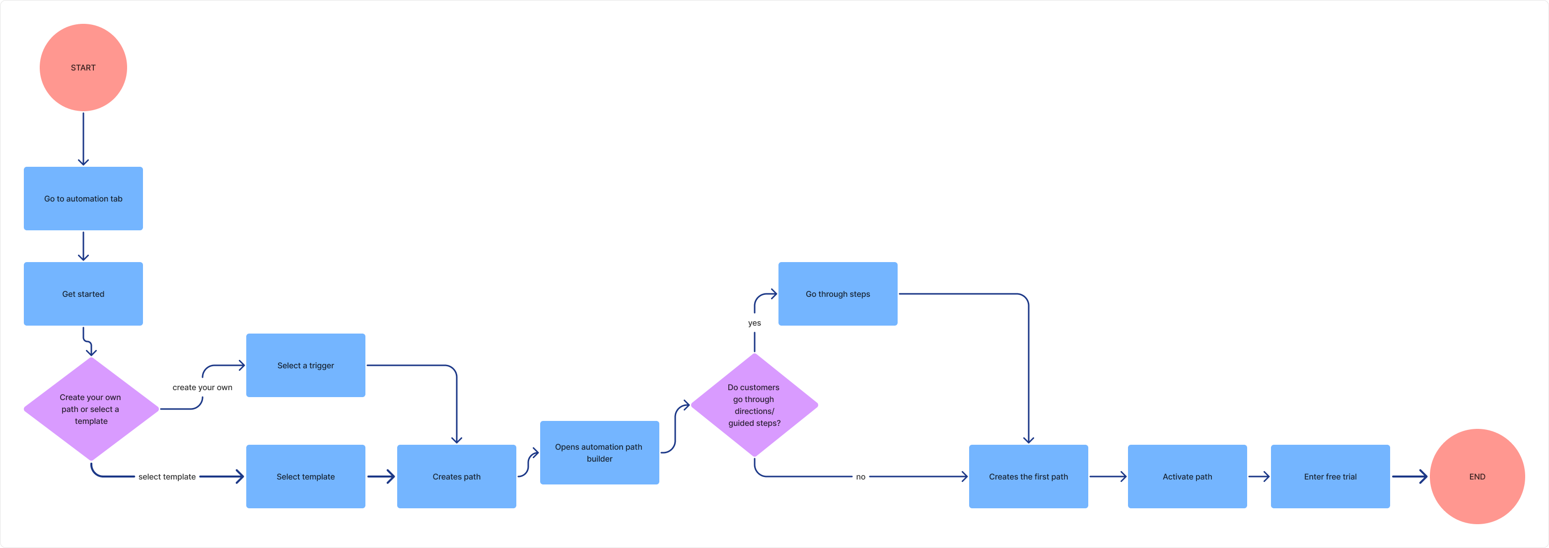
Standard user flow
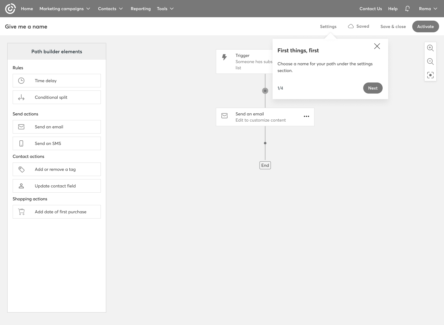
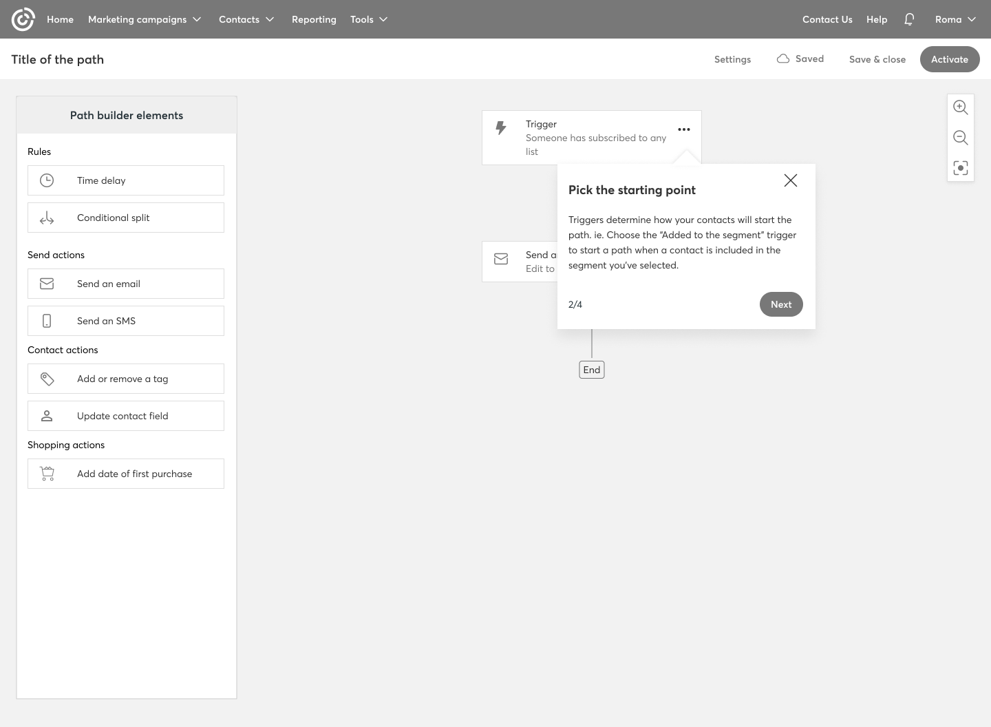
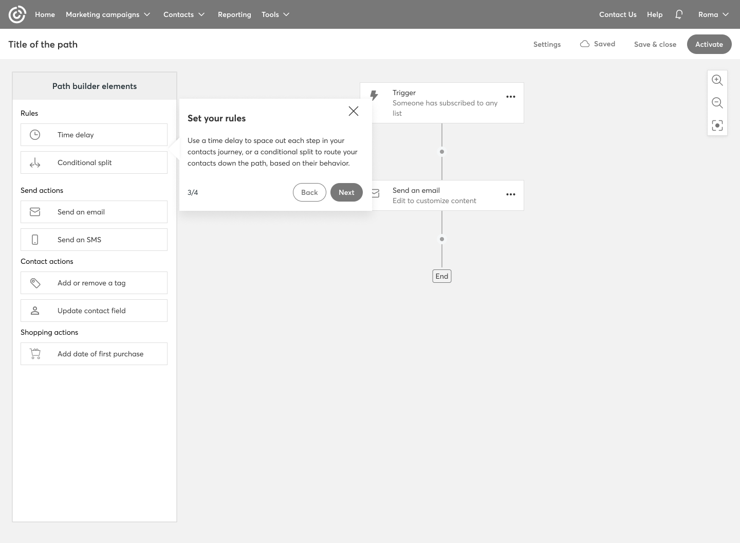
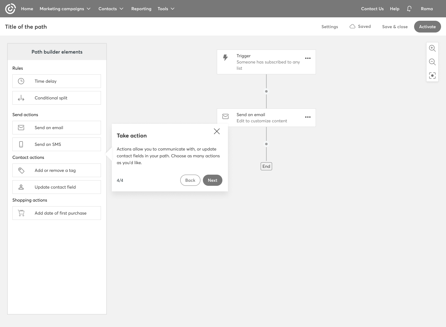
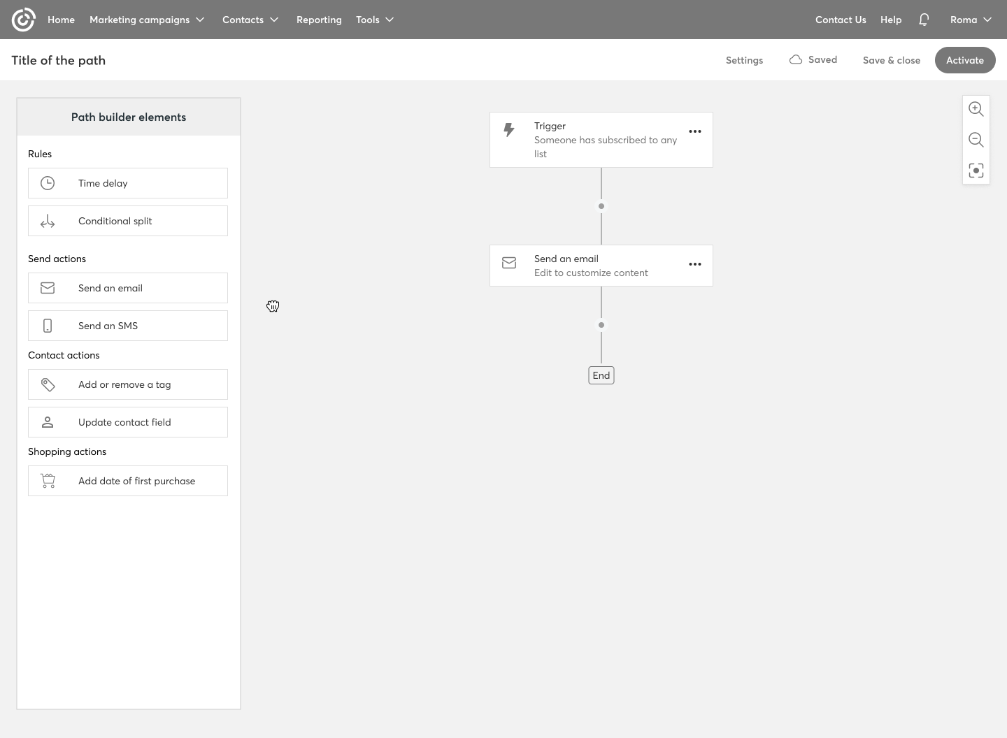
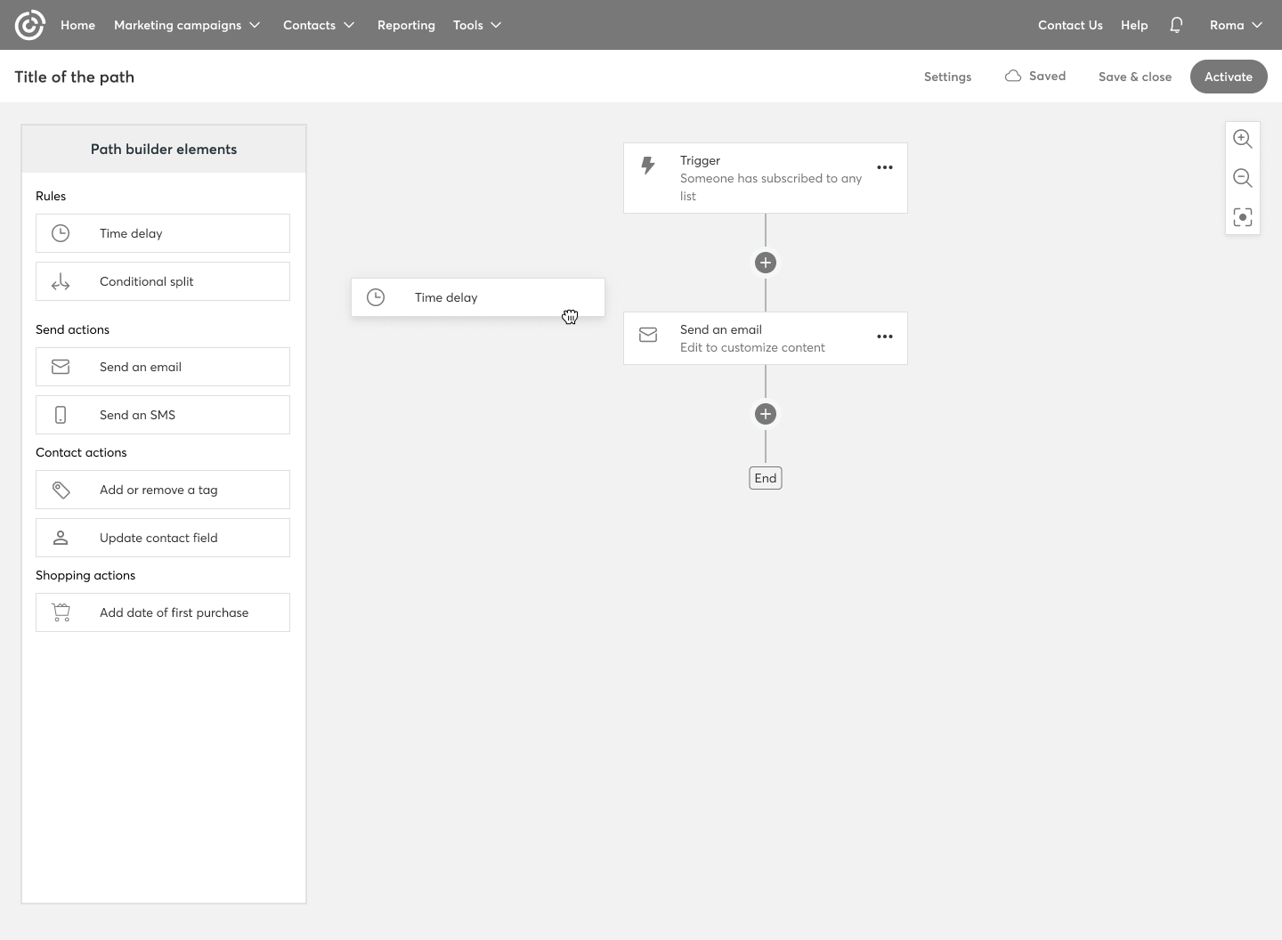
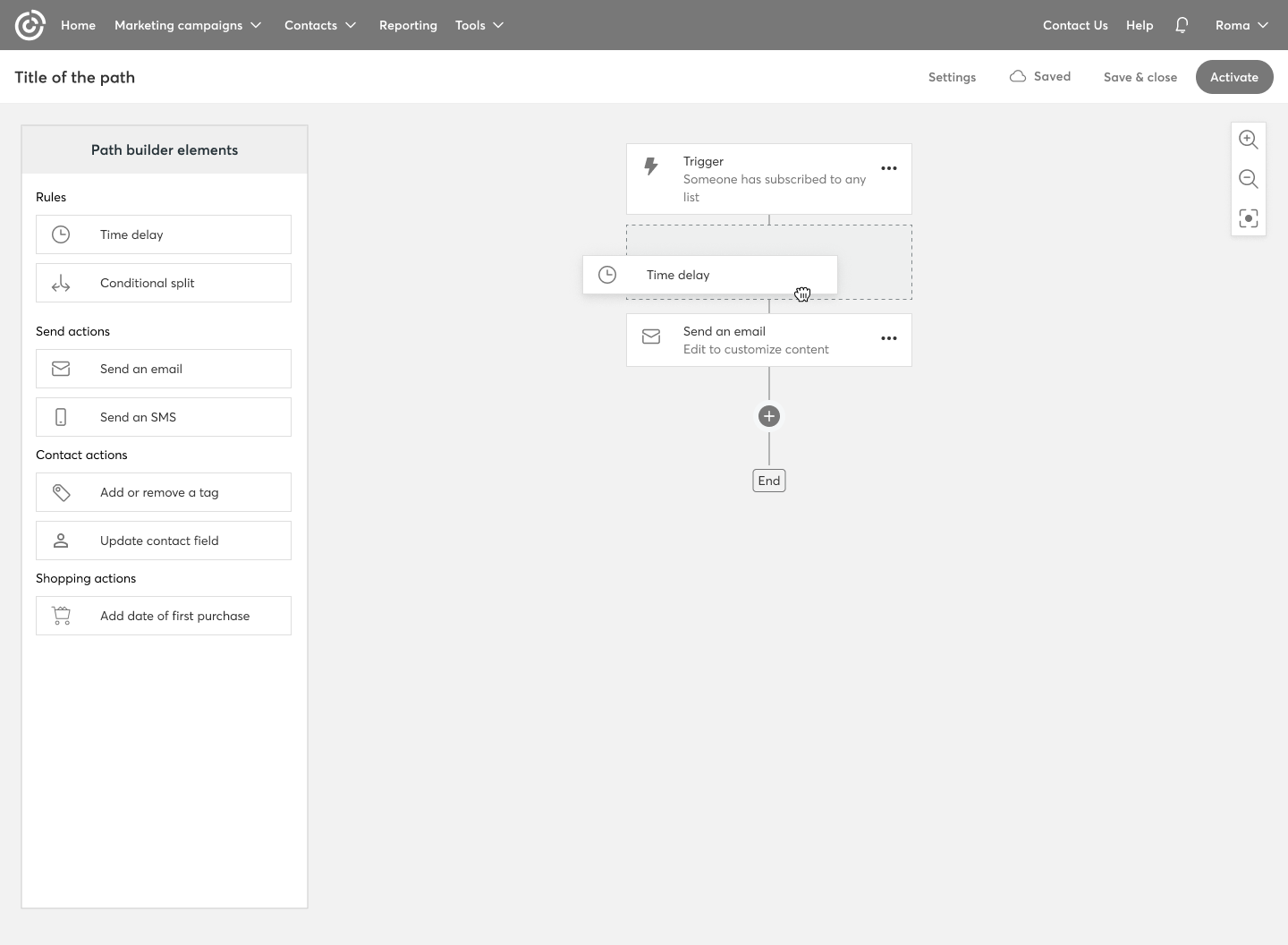
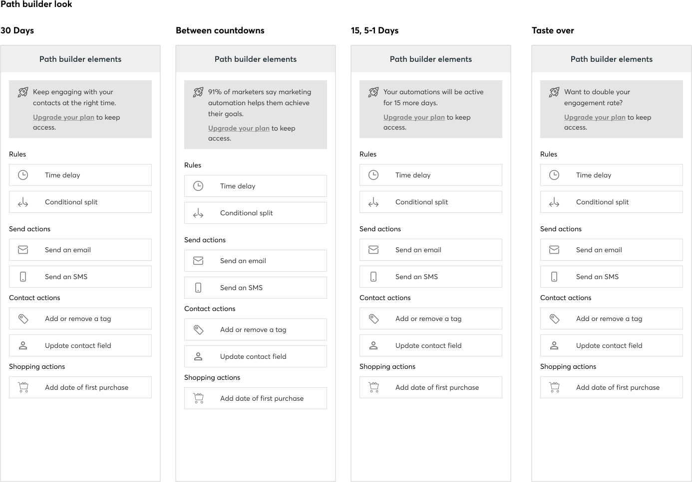
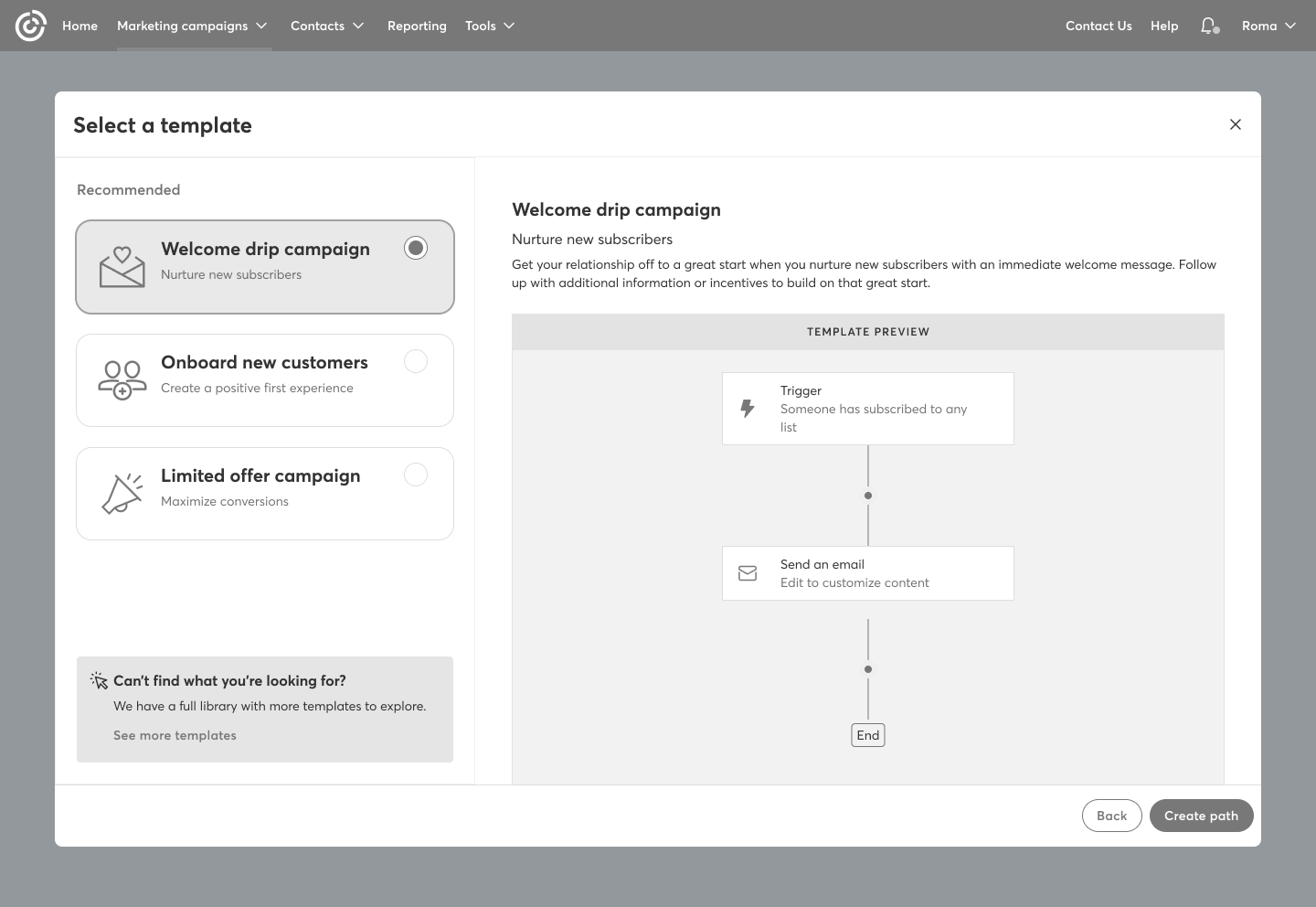
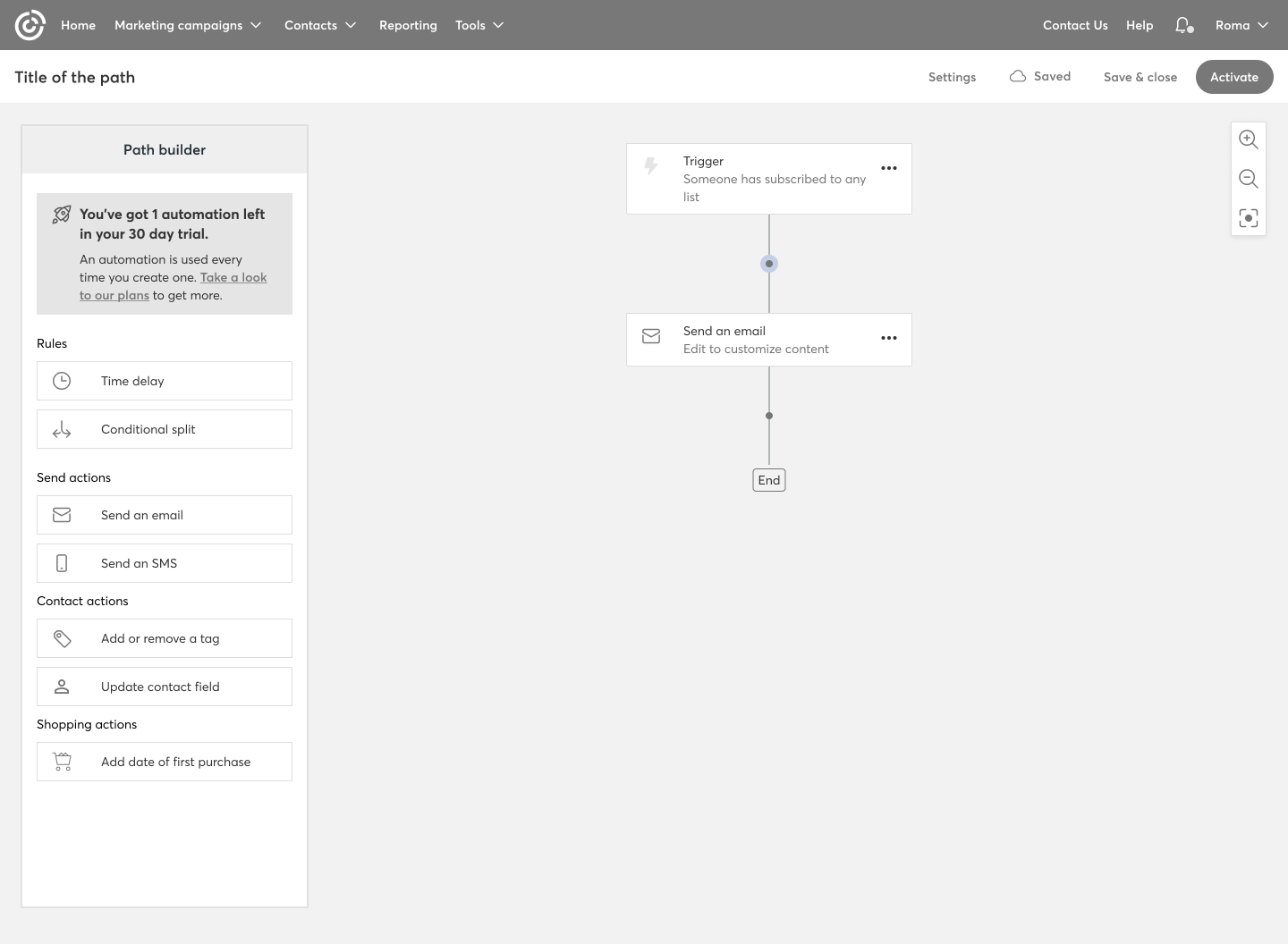
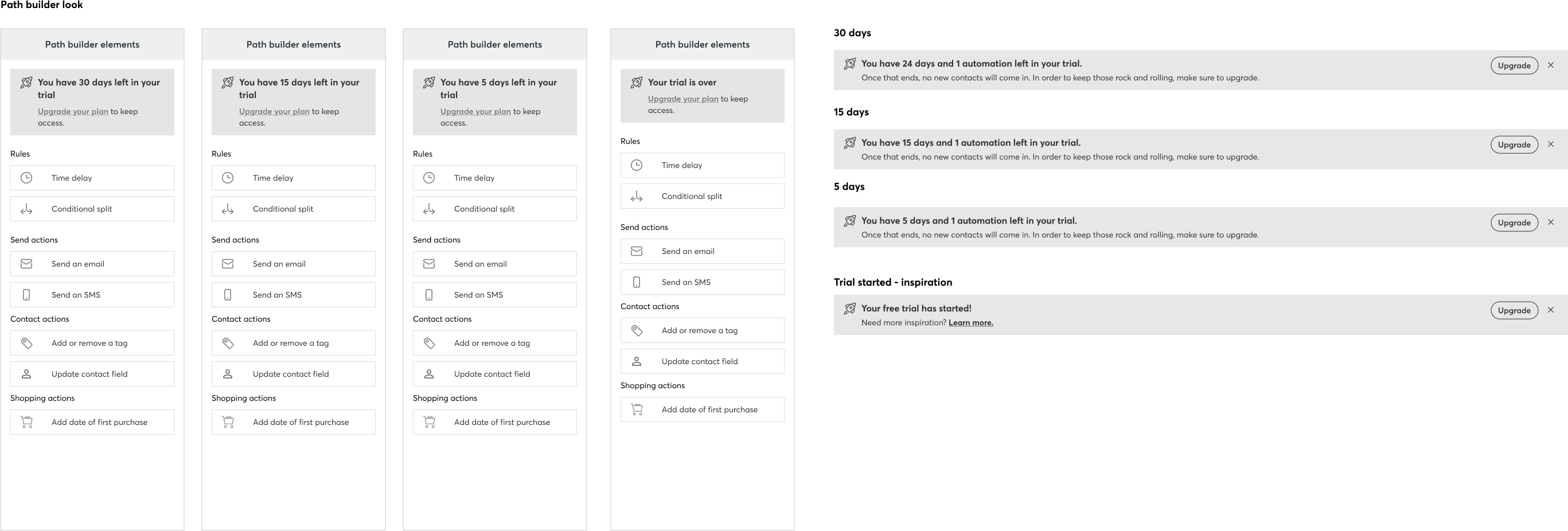
Step by step guidance | How the builder works
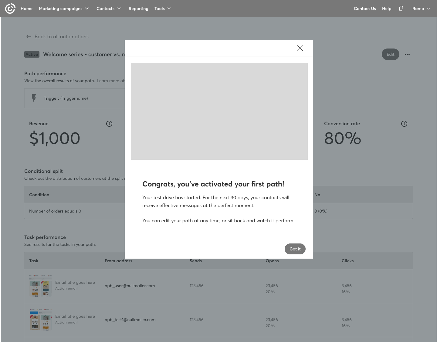
Since this was a new feature, we needed to find a way to showcase how the path builder works. We decided to guide users through it step by step, highlighting the key elements along the way.

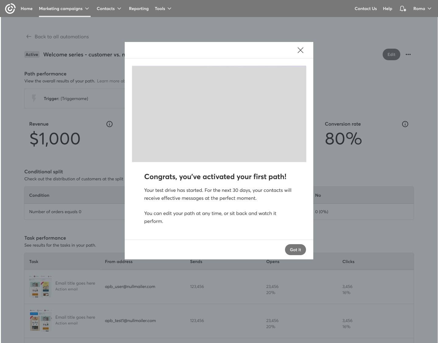
Post-Activation Flow: Messaging and Instructions
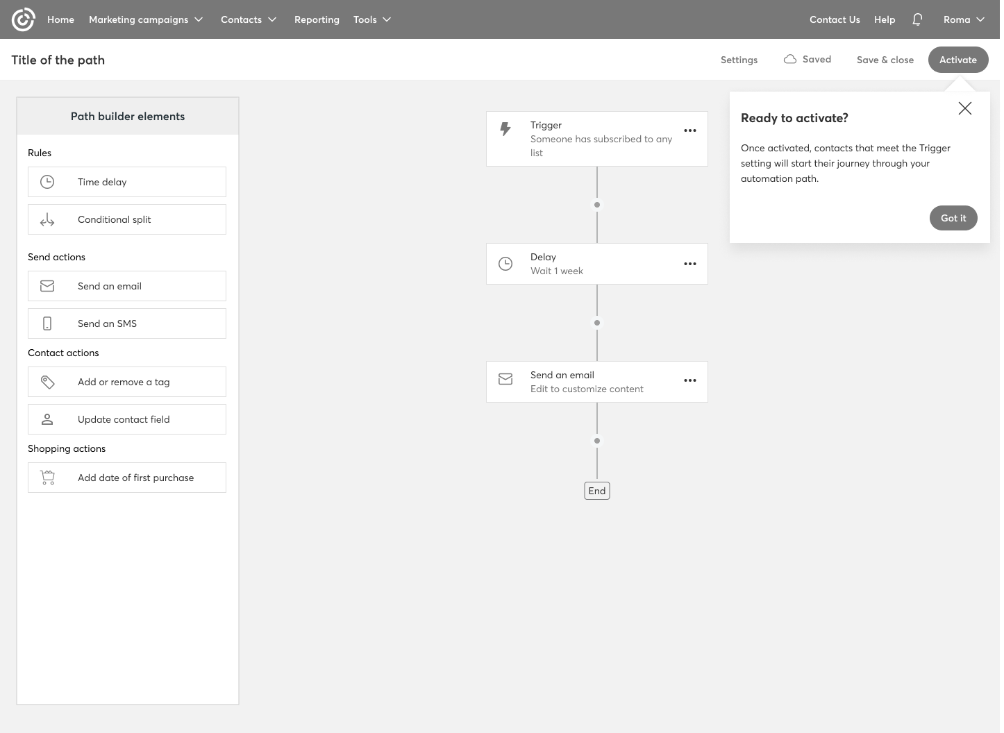
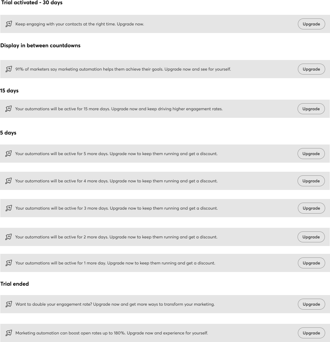
Since they were activating their first automation path, users were automatically enrolled in the 30-day free trial. At this stage, we needed to display a series of contextual messages across different parts of the automation experience—specifically on the Automation Landing Page and the Automation Details Page for that path.
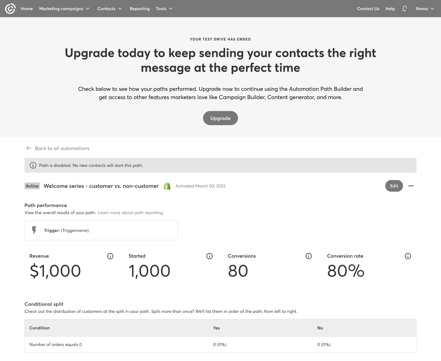
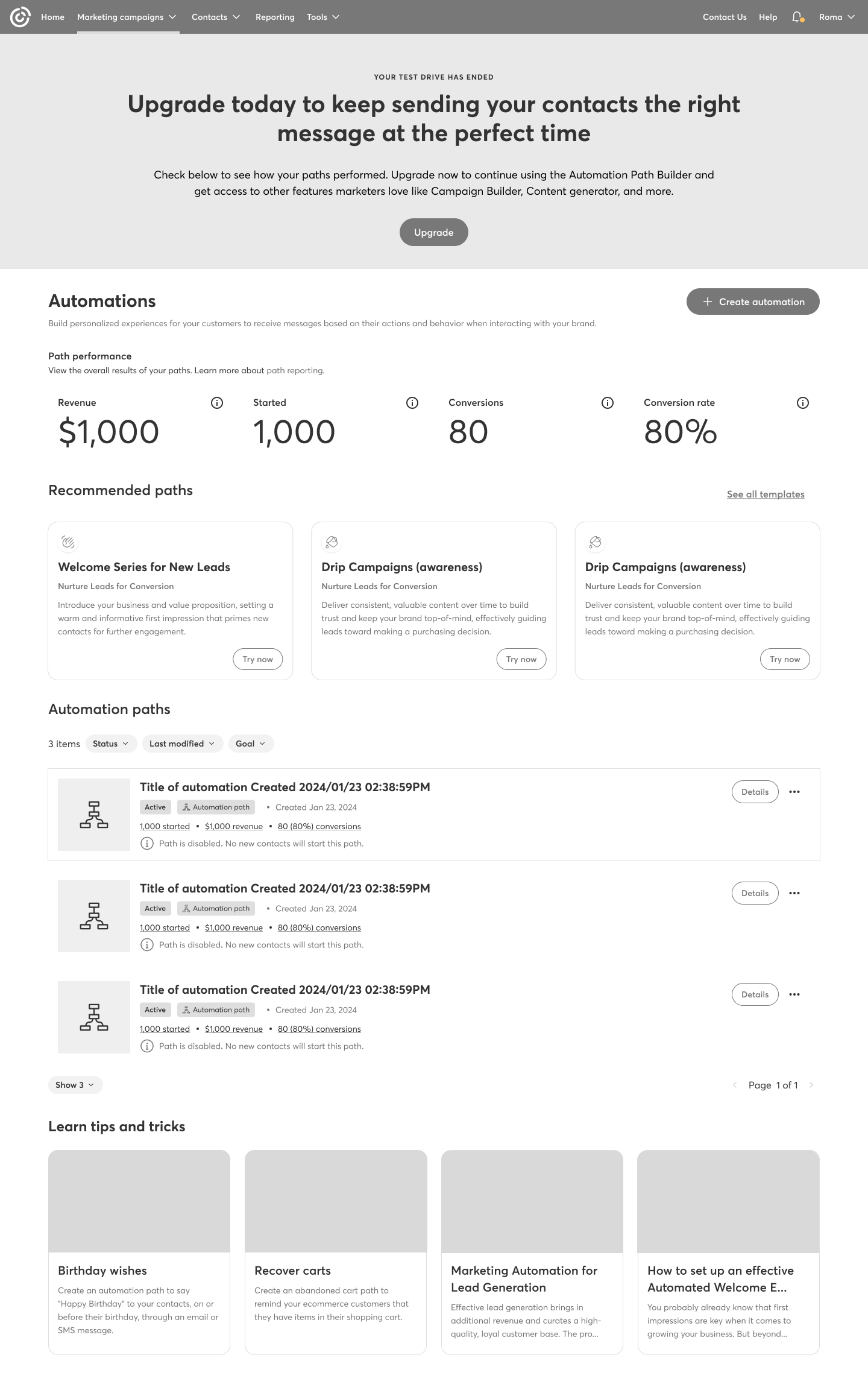
Content Strategy: Communicating Clearly with the User
Content is a key part of UX design. We explored several ways to communicate with users during each stage of the free trial—informing them how many days were left and guiding them on how to upgrade to continue using the feature.
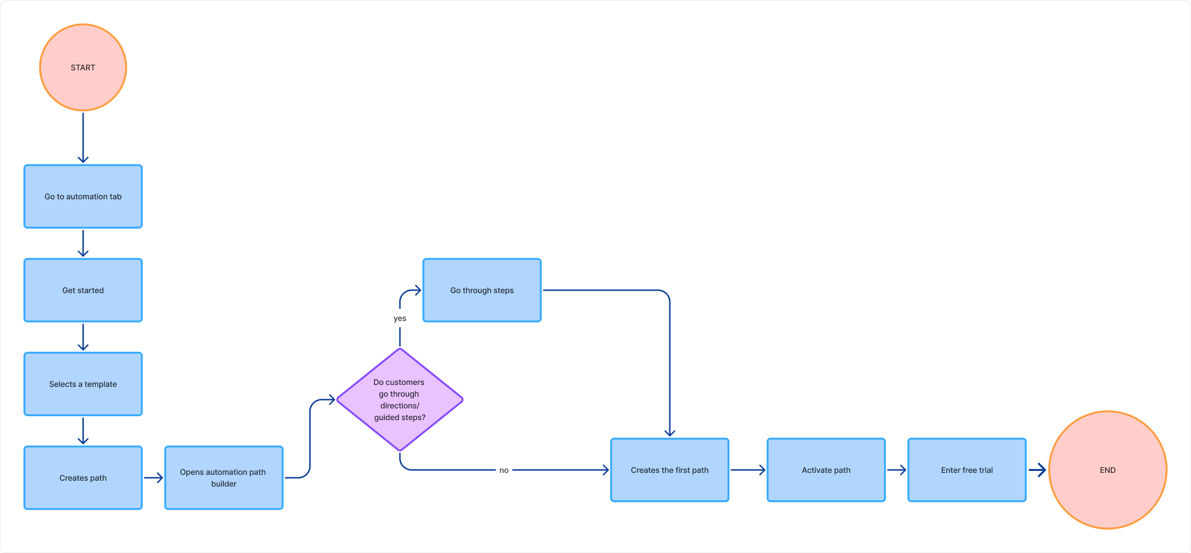
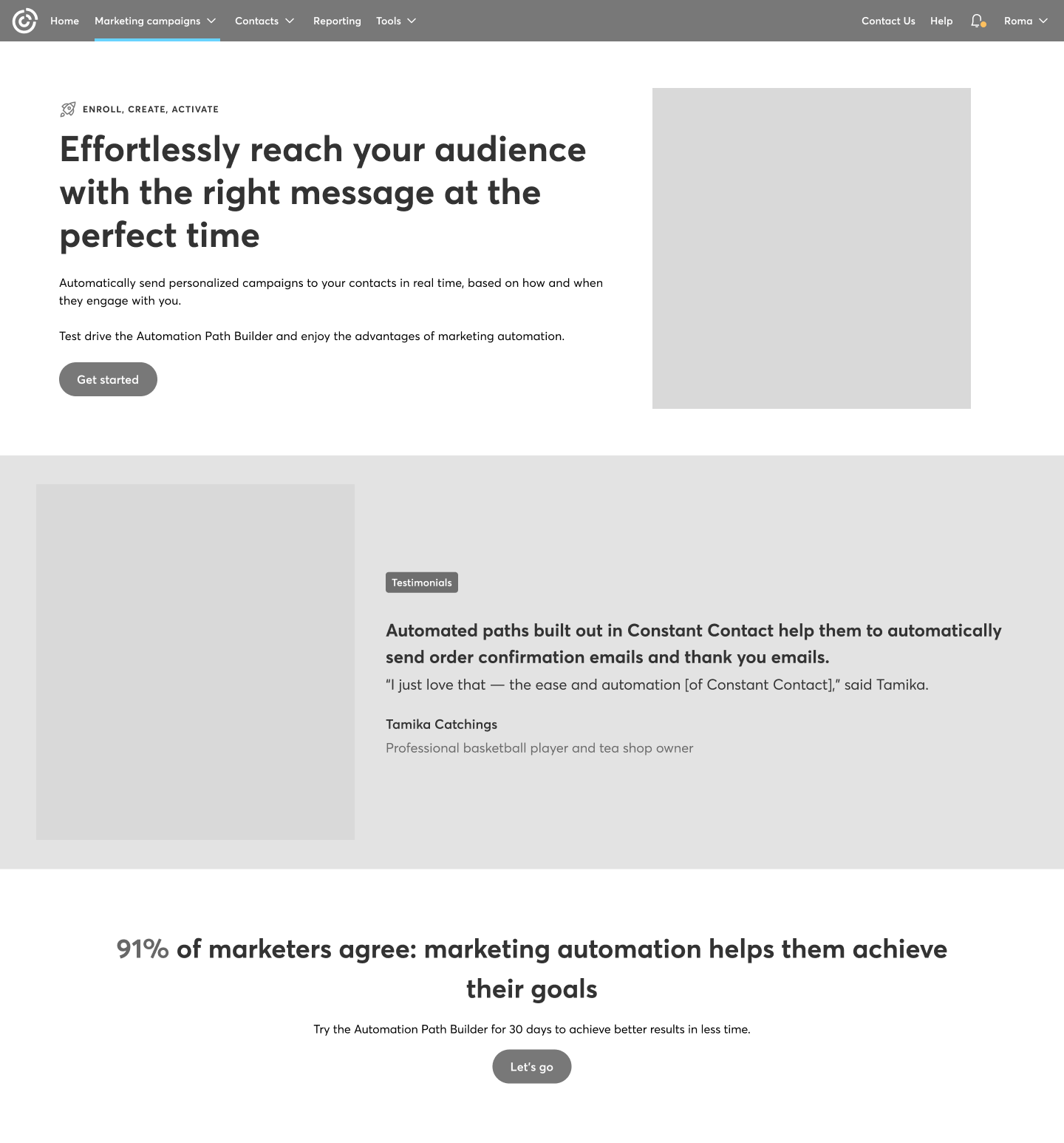
Premium user flow
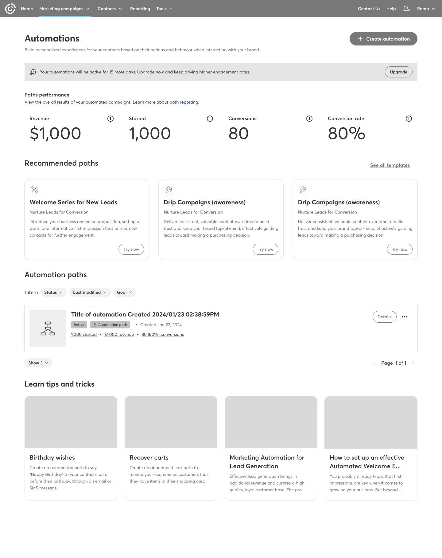
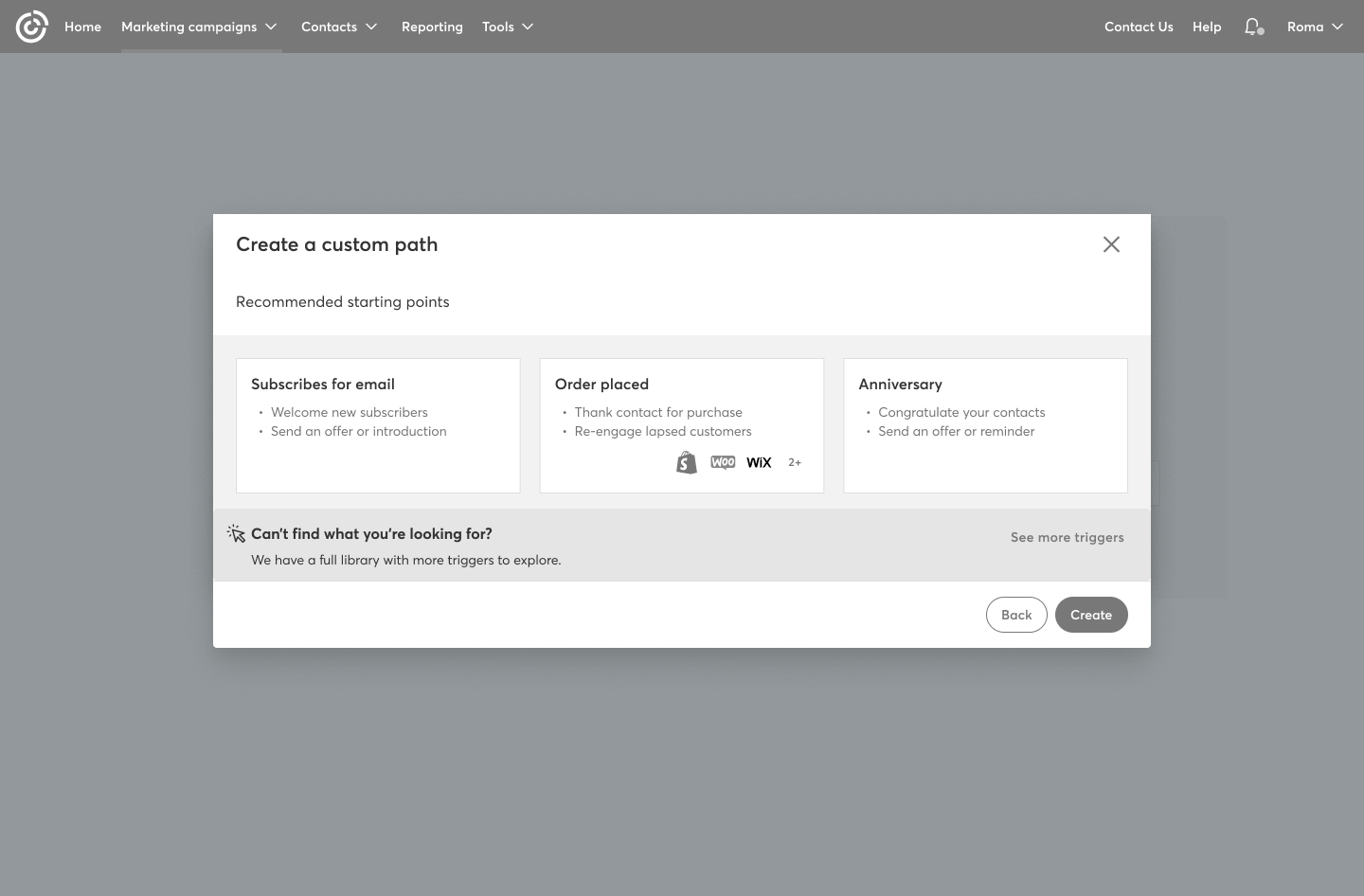
There are a few key elements that differ from the standard flow: the landing page, the option to create a custom path or choose from a library of templates, and the way certain messages are presented throughout the experience.
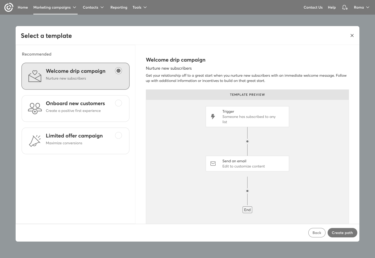
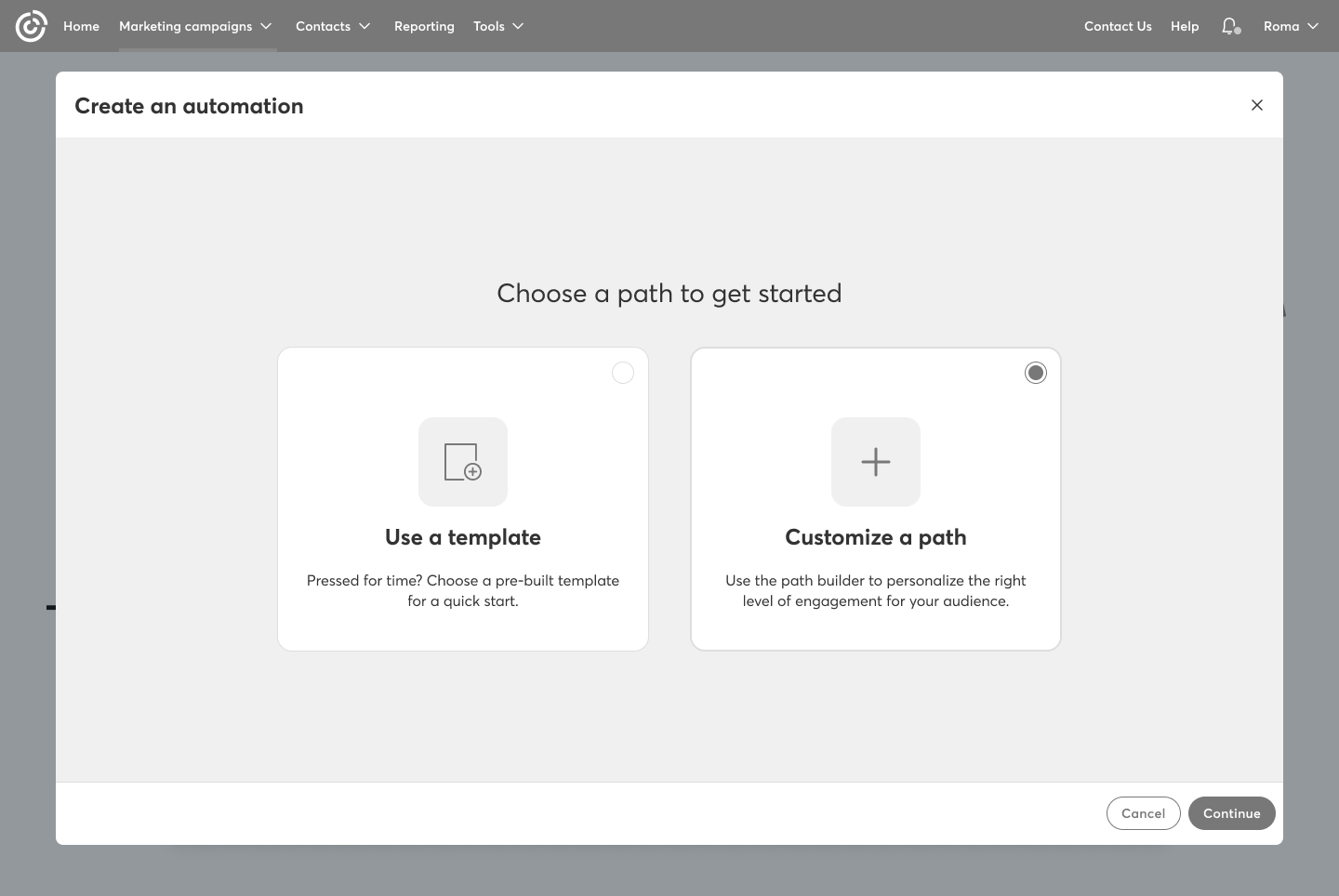
First steps: Select the path to start
As a premium user, they had the option to select a template or create their own path by choosing a trigger to start.
Content Strategy: Communicating Clearly with the User
Content played a key role in guiding users through the trial. We clearly communicated how many days were left, how to upgrade, and for premium users, how many automation paths they had remaining.
Design phase
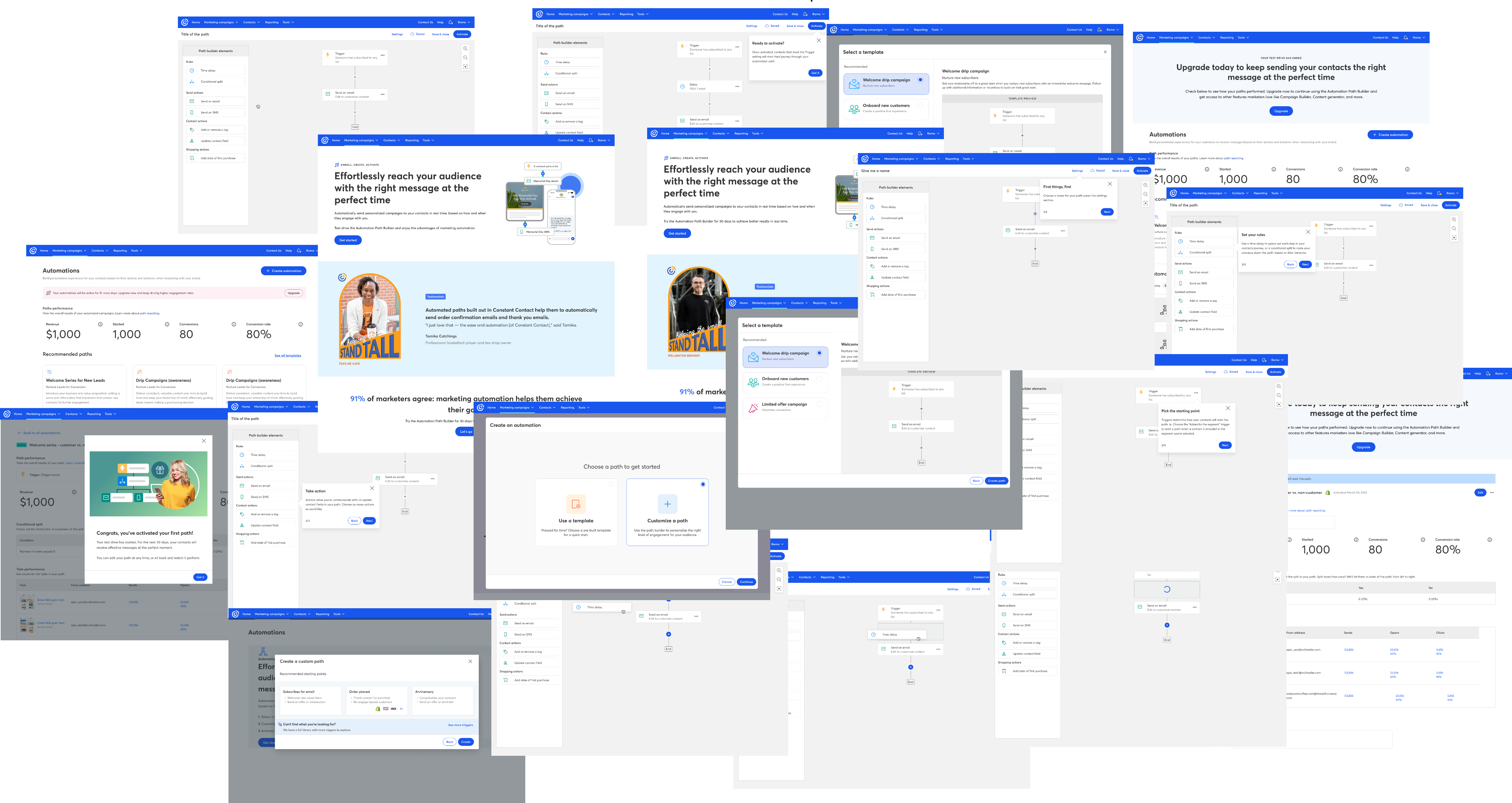
High-fidelity design
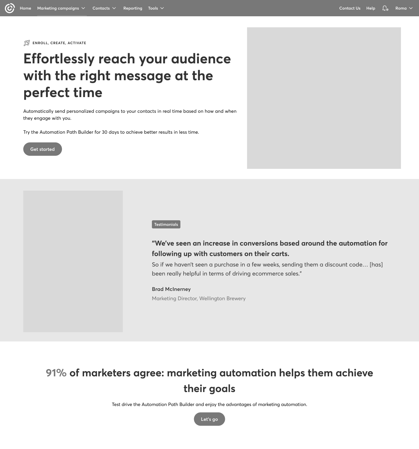
The part everyone likes 🎨. After creating the low-fidelity designs, we had to bring everything to color and add the correct images to bring this to production.
Conclusions
What went well?
We successfully designed an experience through iterative collaboration with stakeholders, reaching alignment on a solution that met both user and business needs. The final design was cohesive with other free trial experiences across the platform, maintaining consistency while standing on its own. Most importantly, it delivered a smooth and intuitive flow that worked well for both standard and premium users, ensuring clarity, flexibility, and ease of use throughout the trial.
What I learned...
This project was a strong reminder that no matter how complex a feature may seem, it always comes down to solving fundamental human problems. If users don’t understand how to use a feature—show them. If the trial experience feels unclear—communicate it clearly and transparently. Simplicity, clarity, and empathy are always at the core of good design. Ultimately, this experience reinforced how design has the power to align people, expectations, and experiences into something cohesive and meaningful.
Next project


